

Choosing the right chart is an important skill for anyone working with data. A good chart can make complex information easy to understand, while the wrong chart can confuse your audience.
Whether you are working in Excel, Power BI, Google Sheets, or another data visualization tool, the chart you choose should depend on the type of data you have and the message you want to communicate.
In this blog, we will understand how to choose the right chart for different types of data with simple examples.
Why Is Choosing the Right Chart Important?
Data visualization is not just about making a report look attractive. The main purpose of a chart is to help people understand information quickly.
For example, imagine you have monthly sales data for a company. You could display it in a table, but a line chart can immediately show whether sales are increasing or decreasing.
A good chart should:
- Make the data easier to understand
- Highlight important patterns
- Help compare different categories
- Show trends and changes
- Make reports and dashboards more useful
- Help decision-makers understand data quickly
The key question is:
What do I want my audience to understand from this data?
Once you answer this question, choosing a chart becomes much easier.
Common Charts and When to Use Them
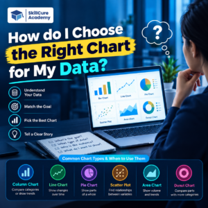
Different charts are useful for different purposes. The following table can help you quickly identify the right chart.
| Chart Type | Best Used For | Example |
|---|---|---|
| Bar Chart | Comparing categories | Sales by product |
| Column Chart | Comparing values | Revenue by month |
| Line Chart | Showing trends over time | Monthly sales |
| Pie Chart | Showing parts of a whole | Market share |
| Donut Chart | Showing simple proportions | Department-wise employees |
| Scatter Plot | Finding relationships | Advertising spend vs sales |
| Area Chart | Showing trends and magnitude | Website traffic over time |
| Histogram | Understanding distribution | Employee salary ranges |
| Combo Chart | Comparing different measures | Revenue and profit |
| Stacked Bar Chart | Comparing composition | Sales by product and region |
1. Use a Bar Chart for Category Comparisons
A bar chart is useful when you want to compare different categories.
For example, suppose a company wants to compare sales for different products:
- Laptop – ₹5 lakh
- Mobile – ₹8 lakh
- Tablet – ₹4 lakh
- Monitor – ₹3 lakh
A bar chart makes it easy to see which products have higher or lower sales.
Use a bar chart when:
- You are comparing categories
- Category names are relatively long
- You want easy value comparison
- You have several categories
2. Use a Column Chart for Simple Comparisons
A column chart is similar to a bar chart, but the columns are displayed vertically.
It works well when you want to compare values across a small number of categories.
For example:
Sales by Department
| Department | Sales |
|---|---|
| Marketing | ₹4 lakh |
| Sales | ₹8 lakh |
| HR | ₹2 lakh |
| Finance | ₹5 lakh |
A column chart can make this comparison visually clear.
3. Use a Line Chart to Show Trends
A line chart is one of the best choices when your data changes over time.
For example, if you have monthly revenue data, a line chart can show whether revenue is:
- Increasing
- Decreasing
- Stable
- Fluctuating
- Showing seasonal patterns
Example:
| Month | Revenue |
|---|---|
| January | ₹5 lakh |
| February | ₹5.5 lakh |
| March | ₹6 lakh |
| April | ₹7 lakh |
The connected points make the movement of revenue easy to understand.
Best for: time-based data such as daily, weekly, monthly, quarterly, or yearly measurements.
4. Use a Pie Chart for Parts of a Whole
A pie chart is useful when you want to show how different categories contribute to a total.
For example, imagine a company’s total expenses are divided into:
- Salaries – 40%
- Marketing – 25%
- Rent – 20%
- Technology – 15%
A pie chart can show the proportion of each expense category.
However, pie charts become difficult to read when there are too many categories.
Tip: If you have many categories or need precise comparisons, a bar chart is often easier to interpret.
5. Use a Scatter Plot to Find Relationships
A scatter plot is useful when you want to understand the relationship between two numerical variables.
For example, a marketing team might compare:
Advertising Spend vs Sales
| Advertising Spend | Sales |
|---|---|
| ₹10,000 | ₹80,000 |
| ₹20,000 | ₹1,20,000 |
| ₹30,000 | ₹1,65,000 |
| ₹40,000 | ₹2,10,000 |
A scatter plot can help you visually investigate whether higher advertising spending is associated with higher sales.
Scatter plots are commonly useful in data analysis, statistics, and business analytics.
6. Use a Histogram to Understand Distribution
A histogram is useful when you want to understand how numerical values are distributed.
For example, an HR team could use a histogram to analyze employee salaries.
Instead of displaying every salary separately, values can be grouped into ranges:
- ₹20,000–₹30,000
- ₹30,000–₹40,000
- ₹40,000–₹50,000
- ₹50,000–₹60,000
This can help identify where most of the values are concentrated.
7. Use a Stacked Chart to Show Composition
A stacked bar or column chart is useful when you want to compare categories while also showing how each category is made up of smaller parts.
For example, you could compare sales across regions while dividing each region’s sales into:
- Product A
- Product B
- Product C
This allows you to understand both the total value and its composition.
8. Use a Combo Chart When You Need Two Measures
Sometimes one chart is not enough because you want to compare two different measures.
For example:
- Revenue
- Profit margin
A combo chart can combine columns and a line to show both measures.
This can be useful in business dashboards where different but related metrics need to be viewed together.
However, make sure the two measures are meaningful to compare. Using too many metrics in one chart can make the visualization confusing.
How to Choose the Right Chart?
A simple way to select a chart is to first identify your objective.
| Your Question | Suitable Chart |
|---|---|
| Which category is bigger? | Bar / Column Chart |
| How has something changed over time? | Line Chart |
| What percentage does each category contribute? | Pie / Donut Chart |
| Are two variables related? | Scatter Plot |
| How are values distributed? | Histogram |
| What makes up the total? | Stacked Chart |
| How do two different measures compare? | Combo Chart |
Ask These 5 Questions Before Choosing a Chart
Before creating a visualization, ask yourself:
1. What am I trying to show?
Are you showing a comparison, trend, relationship, distribution, or composition?
2. Is my data categorical or numerical?
Understanding the type of data helps narrow down your chart choices.
3. Does time matter?
If your main purpose is to show movement over time, a line chart may be appropriate.
4. How many categories do I have?
Too many categories can make charts such as pie charts difficult to read.
5. Who will view the chart?
A dashboard for business executives may need simple, easy-to-read visuals, while an analytical report may require more detailed visualization.
Common Chart Selection Mistakes
Even when the data is correct, poor chart selection can make a report difficult to understand.
Avoid these common mistakes:
- Using a pie chart for too many categories
- Using 3D charts unnecessarily
- Adding too many colors
- Showing too much information in one chart
- Using decorative charts that do not communicate useful information
- Choosing a chart only because it looks attractive
- Forgetting to label axes
- Using misleading scales
- Combining unrelated metrics
Remember:
A chart should make your data easier to understand, not harder.
Chart Selection Example
Imagine you are a data analyst working for an e-commerce company.
You have the following questions:
Question 1: Which product generated the most sales?
→ Use a Bar or Column Chart
Question 2: How did monthly sales change throughout the year?
→ Use a Line Chart
Question 3: What percentage of total sales came from each product category?
→ Use a Pie/Donut Chart for a small number of categories
Question 4: Is advertising spending associated with sales?
→ Use a Scatter Plot
Question 5: What is the distribution of customer order values?
→ Use a Histogram
This is how a data analyst thinks about visualization: start with the business question, then select the chart.
Final Takeaway
Choosing the right chart is an important part of data analysis and data visualization.
You do not need to use complicated charts to create an effective dashboard. In many situations, simple charts such as bar charts, line charts, scatter plots, and histograms can communicate insights effectively.
The best approach is to focus on the question you want your data to answer.
Remember this simple rule:
Comparison → Bar Chart
Trend → Line Chart
Composition → Pie/Stacked Chart
Relationship → Scatter Plot
Distribution → Histogram
Once you understand this basic framework, choosing charts in Excel and Power BI becomes much easier.
Frequently Asked Questions
1. Which chart is best for comparing data?
Bar or column charts are commonly used for comparing values across categories because differences in size are easy to see.
2. Which chart is best for showing trends?
A line chart is generally suitable for showing how a value changes over time.
3. When should I use a pie chart?
Use a pie chart when you want to show parts of a meaningful whole and there are only a few categories.
4. What chart should I use to find relationships between variables?
A scatter plot is commonly used to visualize the relationship between two numerical variables.
5. Which charts are important for a data analyst?
Data analysts commonly work with bar charts, column charts, line charts, scatter plots, histograms, stacked charts, and combination charts depending on the analytical question.